Vodafone V640i with Netfront, one of the worst mobile browsing experiences

This summer I had the opportunity of getting a new phone for free (or for a small fee on some models) included in a new contract that dotMobi got for me. I thought it would be a good idea to get my hands on one of those phones that every normal customer get with their contract. Having loved my Sony Ericsson W810i I thought it would be wise to get another Sony Ericsson, so I chose the V640i, Vodafone exclusive. The phone is not exactly the lowest end on the market in fact it features a very good media player (including a good music player and playlist manager), bluetooth, stereo headphones included and a few more things. The camera is really cheap, very far from the now really old one included in my W810i. Per my personal tastes, the keys are a bit small and the green and red ones are too close to the accesskeys, but overall (and considering it was free) it’s a good phone and does all you would expect from a basic phone and more.

What I was most curious, of course, is the browser. The experience has been very poor and even if the device has the right accesskey configured to connect to Vodafone Live, the NetFront browser is really really bad. While the browser is capable of rendering WML, XHTML Basic and some basic HTML pages, I really do not see any reason why a user or customer would ever use this more than twice. I have a few screenshots that will prove my points, but let’s start saying that while I was browsing I often had no clue if the browser was retrieving content or not, in fact it was often stuck “loading”, but stopping and reloading the page would make it appear instantly, the browser really seems stalled from time to time. Initially I was in doubt if it was the phone, the network or the browser, but once I installed Opera Mini I was sure it was the browser.

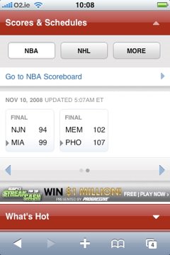
My first test site is Metajam, a site about movies, TV shows and Music. I recommend that you click and see how the page is normally presented so that you get an idea. (Note: the side design has slightly changed since these screenshots were taken)

This is the first thing that I am presented when visiting the site:

At first I thought the site did not work on the V640i.

Clicking on the options accesskey (the left one), I see this item-list where the first item is “accept” (sorry for the poor quality):

I assume this does not tell anything to anyone, but to me, it immediately reminded of the form wizards in some WAP 1 browsers, so I clicked it (and wished I was not accepting something strange such as transferring 1 million dollars to a Nigerian bank).

This is what I saw once clicked, the real page body. Notice how each link is on an individual line, SO 1999:

Clicking again “options” and “accept” I get this very helpful page that I have no clue where it comes from and how it would be of any use:

Later I was looking for a mobie and did not want to browse movies by title, I rather wanted to search by keyword, but I could not find a search menu even though I knew on the iPhone version I had seen one! I took me quite a few pages before I thought about the “options” key. Again, “options” and “accept” was the unexpected solution. Here is another form wizard that you can see only using the “accept” menu. Clicking on the two square brakets opens a blank page where you can type the text and confirm and then be back here, not even automatically go to search.

Again very poor usability!

Enough with forms, let’s see how unordered lists look like. This time I am visiting ta-da.mobi, the test site of DeviceAtlas. Once logged in I go in the “Display” section to test the display size. As you can see the section has two tests and there is a bulleted list:

This is another page in TA-DA, with another bulleted list. The markup is EXACTLY the same, but we have no clue why the browser is displaying a broken image instead of the bullet:

If you are curious, this is the markup of the first page (the one that works):


And this is the code of the second page:

Again, the user will have no clue what’s happening and will think that this is a poor site that doesn’t even have the images in the right paths.

Browsing experience is really poor and some features such as landscape browsing are completely useless and the usability is even worse than with the normal browser. Developer efforts would have been better spent on making the browser work properly. 😉

On the bright side, Opera Mini 4.1 (I have not tested 4.2, yet) works like a charm, it is fast and reliable and both mobile and desktop sites work as expected. A must have for all V640i owners (and maybe all NetFront browser owners).

Apple Safari to support WML?

I was checking the latest changes of the webKit nightly to see if it’s worth updating my current nightly (about 1 month old) to something fresher. While looking at the timeline I noticed how a few commits have been made in the last few days to implement WML card, timer and do tags, some WMLScript and so on. BIG SURPRISE!

You can see for example a few changesets such as [38816], [38833], [38838] and a couple of bugs, #22522 and #22550.

I am definitely among those that think that WML is dead and that everything should be in XHTML by now and surely Apple as a company has been promoting the iPhone and the iPod touch as “full web” devices and in fact Safari Mobile does not even support HTML-MP. The addition of WML seems very strange to me.

OK, the main committer is not an Apple employee, but rather a KDE developer (Nikolas Zimmermann), but we all know that webKit is mostly controlled by Apple and if they are working on WML it means there is some interest. If they are working on WML, why not XHTML-MP?

We’ll see. I’ll keep an eye on this and definitely test a recent nightly!

Windows Mobile 6.5 and Zumobi

It looks like Microsoft has really picked up quite a bit from Zumobi for their next mobile OS.

On Techcrunch they have some screenshots that make it obvious. It will be interesting to see how the UI really works and if it’s any better than the one on current Windows Mobiles. The competition on UIs in mobile is now serious and I look forward to see if Nokia/Symbian will make the leap or will stay stuck on their existing UI (that seems a bit old to me).

PS: If you don’t find anything about a UI desgin on Zumobi, you might want to see this (now old) press release.

ESPN.mobi design

I started reading espn.mobi about a year ago and it used to be an LCD (lowest common denominator) approach for any device. A few months later they started offering a slightly better version for the iPhone and high-end devices, but really the main difference was that articles were not split into multiple pages.

I haven’t used it much in the last couple of months and today I had a great surprise. Accessing with the iPhone I found a completely new and custom layout. The new layout is far from an LCD approach it is actually a very optimized design for the iPhone taking advantage of the AJAXy capabilities of the webKit, but also keeping in mind the iPhone input limitations providing big buttons for fat fingers.
The new homepage and then the pages inside are very colorful and the big (clickable) tabs give you immediately the opportunity to choose the section you are interested into.

The design is (both in the iPhone and non-iPhone versions) focused entirely on the mobile context which is a proof ESPN understand mobile. From the very first moments you see the latest news and real-time scores. Again taking advantage of AJAX, scores are updated automatically every few seconds using a pseudo-ticker with nice little boxes with team names and scores. Very nice to the eye.

The non-iPhone version has also slightly improved from the version that has been available for a few months now.

The non-iPhone version is very light, but still very nice and is very usable on simple devices such as the Sony Ericsson V640.

Some more screenshots taken on my iPhone.

Real-time scores in nice boxes, scrollable sideways:

Latest news:

Section homepage (NBA in this case):

THUMBS UP TO ESPN!

PS: I know the layout of text and images isn’t perfect, but Blogger doesn’t let me do too much without breaking all the standard markup

Everyone wants an App Store these days

Apple has changed the world with the iPhone. Developers (and users sometimes) complained there were no open APIs to build native applications. Apple noted the request and changed the world again with the App Store.

Everyone in the mobile space seems to be running now to create his own store. Google has launched its store called Market (also see a short review with some nice screenshots) and while at this time it’s all free, it is going commercial next year.

RIM has its own BlackBerry Application StoreFront.

T-Mobile, who is already benefiting from Google’s Market, is going to create its own based on Apple’s experience.

Now Orange comes with Orange Downloads.

There are probably more that haven’t announced it, or simply I haven’t heard of.

BUT, did any of these guys ever think that the great thing about Apple’s App Store is that it is one place and there’s no fragmentation? How are these guys going to cope with this? Replicating and renaming won’t solve those issues. They will all be just like the existing “Decks” or portals, simply on a pre-installed application. That will not make them win.

High Efficiency

I always run Rescuetime in the background, even though I have to admit I don’t check it so often (anymore).
It was interesting to see that the week before the DeviceAtlas 2.0 release my efficiency was very high. See here:

It should be noted that normally during the day I spend some time developing and some time writing specs, talking to colleagues, on the phone and so on, but of course, just before the release it was all about development. 🙂

Within the DeviceAtlas team, on Monday 29th September, we worked an average of 11 hours and 30 minutes, plus the what the designers worked, that is probably about the same. What a team!!

Sony Ericsson X1 competition

This definitely the year of funding and competitions. There was the Android competition and then the 10M USD fund. There was the iFund for iPhone applications, there was the Blackberry Fund with a stunning 150M USD and now there’s yet another competition from Sony Ericsson. I got a message from David Cushman who claims to have a lead on this, see here: Sony-Ericsson X1 developer competition coming soon. The details are still lacking, but if you are a Windows (Mobile) developer you might consider this interesting, especially if you were wondering if it’s worth starting something.

For many years developers have been locked out of mobile devices, then J2ME came with its sandbox, it was better than nothing, but it was really limited. Over the years most of those limitation went away, but it looks like this is the year of the open development. So start coding, because mobile (web, J2ME and web applications) is where the is money for companies and developers!

Volantis Mobility Server 5.1

I’m pleased to see that Volantis Announces Mobility Server 5.1. According to the PR version 5.1 is focused around adding connectors for web 2.0 applications such as Picasa and Flickr. Also, the device database has been updated and they now claim more tha 5600 devices! I see that the open-source version of the server is still at 5.0, but I know they are really committed to open-source, so I’m sure they will follow up quickly. These days I’d be especially curious to see the Media Access Proxy in action, if done right it’s still one of the most important things in mobile (get the images right!).

They also announced an update to BuzzCast last week, hopefully my operator will buy it so that I can test it. 🙂 I’m a NetNewsWire addict, so BuzzCast seems quite interesting to me.